Liwru
Liwru means book in Quechua, and adds to the target user of this service. Design of a service based on a low bandwidth population, populations that don’t have access to reading materials or libraries because of different situations such as low income, low resources or geographic location. "Portable library" library that gets to remote places as a based subscription.
Roles
Lead Designer + Researcher
Timeline
September 2018 - December 2018

Problem
Lack of resources for people who live outside the city, at rural areas & country side.
Limited resources such as: money, time, location and transportation
Since they have low income they have different priorities, so different income allocation
800 M
Problem
People above the ages of 15 are illiterate
10%
or 35 million people of South's America population are illiterate,
628,494
People in Ecuador are illiterate and don't have access to education
Design Principles
Long-lasting
My design is long-lasting because we use community services that already exist, and is based on donations, so as long as people keep donating books, and as long as people have the desire of reading this could exist forever. Literature never ends.
Human
My design treats people with respect, because we are looking to help people with less resources in a way that they will not feel bad or discriminated for having less resources, but happy because there are people willing to help.
Honest
My product does not attempt to manipulate consumers in any way, since the only thing we are offering is portable library, with a subscription and with honesty from consumers my product is intend to work properly.
User Journey Map
After conducting my secondary research I decided to do a user journey based on the insights and on one of the personas created for the user experience for Liwru

Design Process
Testing
After conducting secondary and primary research I went ahead with prototypes and started testing and iterating with rapid low fidelity prototypes and different workshop sessions


Testing Feedback
Add new questions to include more information in the user profile
Make the insturctions and what the box contains more clear and simple for user
Create compartment/pocket for different artefacts found in box
Include clear directions on how to return the box
Add quote to create a more personalized service
Second Round Testing
After going through several testers I went through the insights I went ahead and changed specific aspects to create a better user experience for the persona


Testing Feedback Insights
Add new questions, changed subscription form to make it more inclusive, added the idea of family pack and individual use
Add service of mental exercises to follow the idea of reading and of being good for your wellbeing
Laid out the materials in a organized and labeled way, so service is simplified
Visual Identity

Moodboard
Confident Teal
I chose teal because it is bright enough to be liked by people but its not that bright that is loud. It also connects to the calmness and to the well being element of excercising your mind
Sans Serif
I chose a round bold sans serif to connect to the human element of my design principles, rounded typefaces connects with humanity and its approachable and gives a trustworthiness feeling


Delivering the Promise
Long-lasting
Reusable, allows connection with other members of the community, still based on donations, and on how people react to service
Human
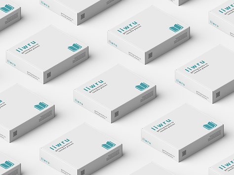
Simplified look, following the feeling of mood board, minimalistic design, simple and very easy to connect with the user.
Honest
Inclusive, and gives people what they are offered, and supports them in further way. Ex: Mental Exercises
